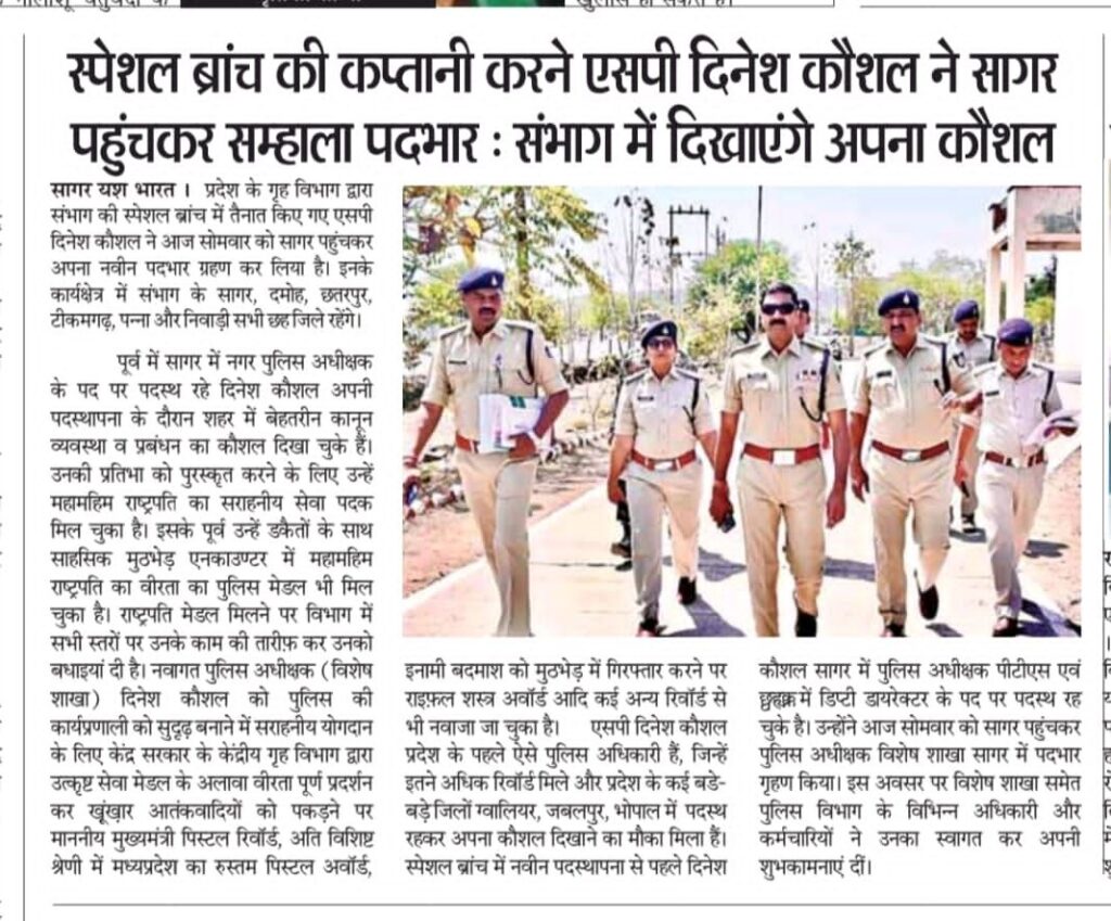
सागर संभाग की स्पेशल ब्रांच के प्रमुख होंगे पुलिस कप्तान दिनेश कौशल सागर पहुंचकर पदभार संभाला
Published:
Related articles

Recent articles

/* — Desktop & General Styling — */
/* Target the main container of the floating button */
.gt_float_switcher {
/* Method 1: Use transform scale for overall reduction */
transform: scale(0.7); /* Adjust this value (e.g., 0.6 to 0.9) to make it smaller or larger */
transform-origin: bottom left; /* Since it’s on the bottom left, scale from that origin */
/* Important: Adjust its position slightly after scaling if it moves too far from the corner. */
/* If original was left:30px, bottom:30px, you might need to adjust for the scaled size. */
/* Example adjustment (uncomment and fine-tune if needed): */
/* left: 20px !important; */
/* bottom: 20px !important; */
}
/* Method 2: Explicitly set width and height if scaling causes layout issues */
/* You can comment out Method 1 (transform) if you use this. */
/*
.gt_float_switcher {
width: 100px !important; /* Adjust as needed, e.g., 80px, 90px, 110px */
height: 30px !important; /* Adjust as needed, e.g., 25px, 28px, 32px */
overflow: hidden !important; /* Hide any content that overflows the new smaller size */
/* Further adjust font size of internal elements if they don’t fit */
.gt_current_lang {
font-size: 12px !important; /* Smaller font size for the language text */
line-height: 1.2 !important; /* Adjust line height if text wraps weirdly */
padding: 4px 8px !important; /* Adjust padding inside the button */
height: auto !important; /* Ensure height adjusts to content */
}
/* If there are flags, you might need to resize them too */
.gt_current_lang img {
width: 16px !important; /* Smaller flag image */
height: auto !important;
}
}
*/
/* Adjust the font size and padding of the current language display */
.gt_current_lang {
font-size: 14px !important; /* Slightly smaller font for desktop view */
padding: 6px 10px !important; /* Reduce padding around the text/flag */
height: auto !important; /* Ensure height is flexible */
line-height: normal !important; /* Reset line-height if plugin applies custom */
}
/* Make sure the flag image within the current language display is also scaled properly */
.gt_current_lang img {
width: 20px !important; /* Smaller flag width */
height: auto !important; /* Maintain aspect ratio */
}
/* — Mobile Optimization — */
@media (max-width: 768px) { /* Standard breakpoint for tablets/mobile */
.gt_float_switcher {
/* Further reduce size for mobile using transform scale */
transform: scale(0.55); /* Even smaller, e.g., 55% of original */
transform-origin: bottom left; /* Keep origin consistent */
/* Adjust mobile positioning if it overlaps content or is too close to edge */
bottom: 15px !important; /* Move up slightly */
left: 15px !important; /* Move right slightly */
}
/* Further adjust font size and padding for very small screens if needed */
.gt_current_lang {
font-size: 12px !important; /* Even smaller font size for mobile */
padding: 4px 6px !important;
}
.gt_current_lang img {
width: 16px !important; /* Smaller flag for mobile */
}
}
/* For very small screens (e.g., iPhone SE portrait, less than 400px width) */
@media (max-width: 480px) {
.gt_float_switcher {
transform: scale(0.5); /* Smallest size for tiny screens */
bottom: 10px !important; /* Even closer to the edge */
left: 10px !important;
}
.gt_current_lang {
font-size: 10px !important;
padding: 3px 5px !important;
}
.gt_current_lang img {
width: 14px !important;
}
}
/* — Existing CSS for desktop (keep this, it might work for desktop if the mobile selector is found) — */
.td-header-top-menu-item .tdb-top-menu-item {
display: none !important;
}
.td-header-mobile-menu .td-block-wrap.td-menu-item.td_mobile_template_8[data-td-block-uid=”tdi_5″] {
display: none !important;
}

© Copyright 2025 Journalist Satish Pathak . All Rights Reserved. Made with ♥ by TOM (Town of Marketing)